Colors That Haunt, Cloak, and Propel: A Cinematic Comparison

Today we explore Genre-Specific Color Strategies: Horror, Noir, and Sci‑Fi Compared, tracing how palettes sculpt emotion, tension, and meaning. You will see how hue, contrast, and texture steer fear, ambiguity, and futuristic awe, then learn practical tools for building swatches, lighting scenes, and grading with intention. Share your favorite films, subscribe for future deep dives, and test these ideas in your next frame, storyboard, or grade to feel how color quietly rewires the audience’s heartbeat.

Why Colors Frighten, Cloak, and Imagine

Color is a psychological shortcut to feeling. Horror leans into decay and contrast to provoke survival instincts; noir uses darkness and greys to expose moral uncertainty; sci‑fi stretches toward speculative harmonies that hint at technology and the unknown. We will anchor choices in perception science—luminance priorities, cone response, and learned cultural meanings—while staying grounded in storytelling beats. Expect practical, artful logic, not rigid rules, so you can decide when to risk unusual palettes and when to let classic, time-tested combinations do the heavy lifting.

Building Palettes That Serve Story Beats

A good palette starts with verbs, not swatches. Decide whether a moment should constrict, seduce, accuse, soothe, or accelerate, then translate that action into hue families, contrast levels, and texture cues. Build a primary triad for stability, an accent for surprise, and a danger color reserved for pivotal turns. Measure ratios between skin, wardrobe, set, and motivated light so emotional balance stays consistent. Think continuity: a signature undertone can survive location changes, binding scenes together while still granting each environment a fresh, character-specific variation.

Horror Palette Kit: Rot, Ash, and Arterial Accents

Start with ashen neutrals and cool, swampy greens to create a baseline of quiet unease. Add fractured textures—peeling paint, damp fabrics, matte surfaces—that swallow light. Reserve saturated red strictly for narrative ruptures, and let mustard or nicotine yellow stain props to suggest neglect. Keep a pocket of warm candlelight to humanize characters when stakes peak, allowing viewers a breath before the next drop. Track contamination: let fear colors invade more wardrobe and walls over time, so the house, the woods, or the basement seems to digest the cast.

Noir Palette Kit: Ink, Smoke, and Polished Steel

Define honest blacks with subtle blue or cyan bias to prevent muddy grays, then layer smoke to erase midtone clutter. Introduce a single reflective surface—rain, lacquer, chrome—to catch highlights that outline intentions and secrets. Skin should stay neutral yet dimensional, never orange; lips and ties can own the sole warm note if motivated by story. Street lamps, blinds, and doorway pools furnish iconic shapes, letting composition, not color fireworks, carry the mood. Keep a spare red for evidence, warning lights, or the final, irreversible decision.

Sci‑Fi Palette Kit: Interface Teals, Lab Whites, and Hyperspace Violets

Anchor the world with clean whites tuned slightly cool to imply sterilization and procedural control. Layer interface teals, lucid cyans, and desaturated blues to signal data flow without eye fatigue. Sprinkle spectral violets for propulsion, quantum, or alien phenomena, but gate them to specific technologies so lore feels coherent. Skin must stay believable; counter aggressive cyans with soft, warm key to preserve humanity. Consider emissive props with dimmable channels, allowing palette transitions to ride performance beats. When unknowns arrive, let color shift first, before dialogue does.

Light, Shadow, and the Science of Fear and Futurity

Lighting is color’s enforcement arm. By shaping luminance, you decide which chroma survives and which dies. Horror often favors low-key setups with intentional spill, letting darkness leak into places safety once lived. Noir sculpts with hard sources, tight flags, and architectural patterns, while sci‑fi thrives on indirect bounce, soft panels, and motivated glows. Consider spectral quality: gels, RGB fixtures, and practical bulbs each bend color differently. Test with a gray card and a calibrated display, ensuring choices survive the grade and various delivery standards.

Horror Lighting Recipes: Entrapment Through Negative Fill

Begin by stealing light—add negative fill close to actors to let shadows grip the face. Use a cool edge to describe space, then puncture with a dimmed tungsten practical that flickers imperfectly. Fog or haze thickens mids, making small lights feel predatory. Keep sources asymmetrical and slightly off-axis to disturb symmetry the brain reads as safety. If a monster never fully shows, allow color to betray it first: a blister of warmth on a cold wall, or a creeping green reflection crawling across a blade.

Noir Lighting Recipes: Geometry Carved by Contrast

Hard keys through blinds, motivated by streetlamps or a high window, sketch maps of power and confinement. Flags, cutters, and snoots maintain discipline, while controlled bounce softens only the necessary truth. Let practicals define perspective lines—bar lights, neon, a diner’s chrome edge—so composition becomes fate. When faces turn, allow highlights to roll like confessions, then vanish into clean black. Resist fashionable haze unless story demands it; crisp air lets angles argue. The palette breathes through exposure discipline more than hue saturation or flamboyant gels.

Sci‑Fi Lighting Recipes: Emissive Worlds and Calibrated Softness

Use broad, soft sources from above or behind screens to suggest advanced, user-centric design. Emissive panels, LED strips, and translucent materials can carry functional color while remaining photographically gentle. Introduce micro-movement—scans, pulses, or diagnostic sweeps—so light behaves like a system, not decoration. Keep contrast elegant, ensuring eyes never fatigue from competing glows. When the narrative destabilizes, narrow the spectrum or introduce non-terrestrial hues through particulate atmospherics. The goal is believable sophistication: light should seem engineered by the world, not by a filmmaker’s hand.
Horror Examples: The Shining, It Follows, Hereditary

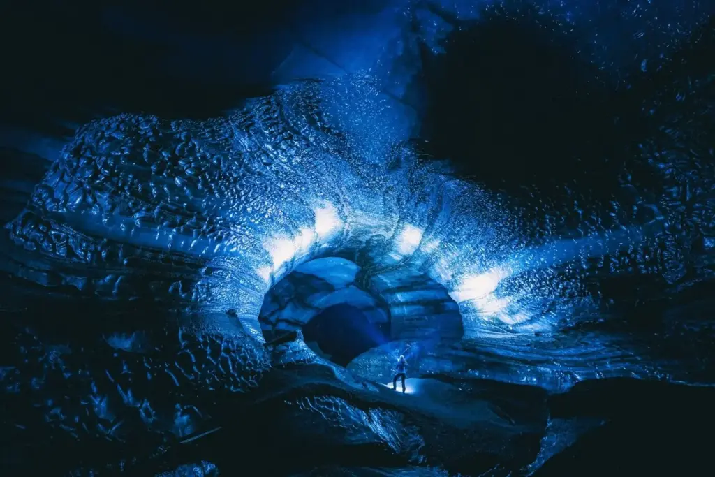
Kubrick’s cool corridors and sickly carpet tones corral the boy into a maze of controlled dread, while the bar’s amber seduction feels treacherously safe. It Follows drapes suburban blues with sudden red intrusions, turning sidewalks into tripwires. Hereditary leans into wood tones that grow claustrophobic as grief stains daylight. Across them, a pattern emerges: domestic colors curdle. Study when warm light comforts versus when it becomes complicity, then document those pivot points for your own sequences and design bible.

Noir Examples: Double Indemnity, The Third Man, Brick

Double Indemnity builds moral pressure through razor shadows that slice across faces like verdicts. The Third Man’s wet streets and tilted compositions channel disorientation, letting silver highlights testify against everyone. Brick modernizes the grammar in sunlit settings, yet grades toward disciplined contrast that guards mystery. Across eras, noir trusts restraint: a limited palette, consistent exposure, and compositional hierarchy. Take notes on where the brightest value lands in each shot and ask why. That answer often reveals the scene’s true power broker.

Sci‑Fi Examples: 2001, Ex Machina, Annihilation

2001 uses monumental whites and disciplined primaries to render technology as cathedral; color only blooms where human fallibility or cosmic threat intrudes. Ex Machina pairs glassy cools with skin-forward warmth to interrogate desire and control. Annihilation bends botanical palettes toward unsettling iridescence that refuses easy categorization. The lesson is coherence: define a baseline world, then bend its rules only when narrative demands. When you introduce a new hue, also introduce a reason—material, biology, or interface—so wonder feels grounded rather than arbitrary.

Workflow Alchemy: Grading Tactics That Lock the Mood

Consistency requires a deliberate pipeline. Choose a color management framework—ACES, DaVinci Wide Gamut, or an in-camera matrix—and test with a calibrated display chain. Build look transforms as adjustable, versioned layers, not monolithic LUTs. Isolate skin, protect specular highlights, and manage saturation by luminance so brights never cartoon. Keep look references, scene stills, and swatch sheets in your timeline. When deadlines bite, a clear node graph or layer stack is survival. The creative magic lasts only if the recipe is accountable and repeatable.

Horror Grade: Shadow Integrity, Controlled Blood, Breathable Skin

Map your nodes to prioritize luminance before hue, protecting shadow texture from muddy crush. Introduce a cool bias in lows, then gate saturated reds through a precise qualifier so blood stays alarming without clipping. Apply a gentle, warm parallel path for skin during vulnerable beats, then collapse it when danger owns the room. Consider film grain in mids to add organic unease. Maintain a saved, bypassable shock layer for jump moments, letting you deploy sudden chroma spikes without wrecking overall continuity.

Noir Grade: Discipline First, Flourish Last

Begin with contrast mapping that respects roll-off and keeps black detail alive. Use logarithmic tools to steer highlight placement, ensuring practicals sing without haloing. Desaturate globally, then reintroduce micro-warmth only where narrative focus demands. Watch for color contamination in shadows from mixed sources; neutralize quickly to preserve graphic clarity. Save stylistic signatures—a faint cyan steel, a specific bloom—for closing shots or reveals. If you can remove a layer and the story still reads, remove it. Elegance loves subtraction.
Sci‑Fi Grade: Clean Management with Targeted Spectral Drama

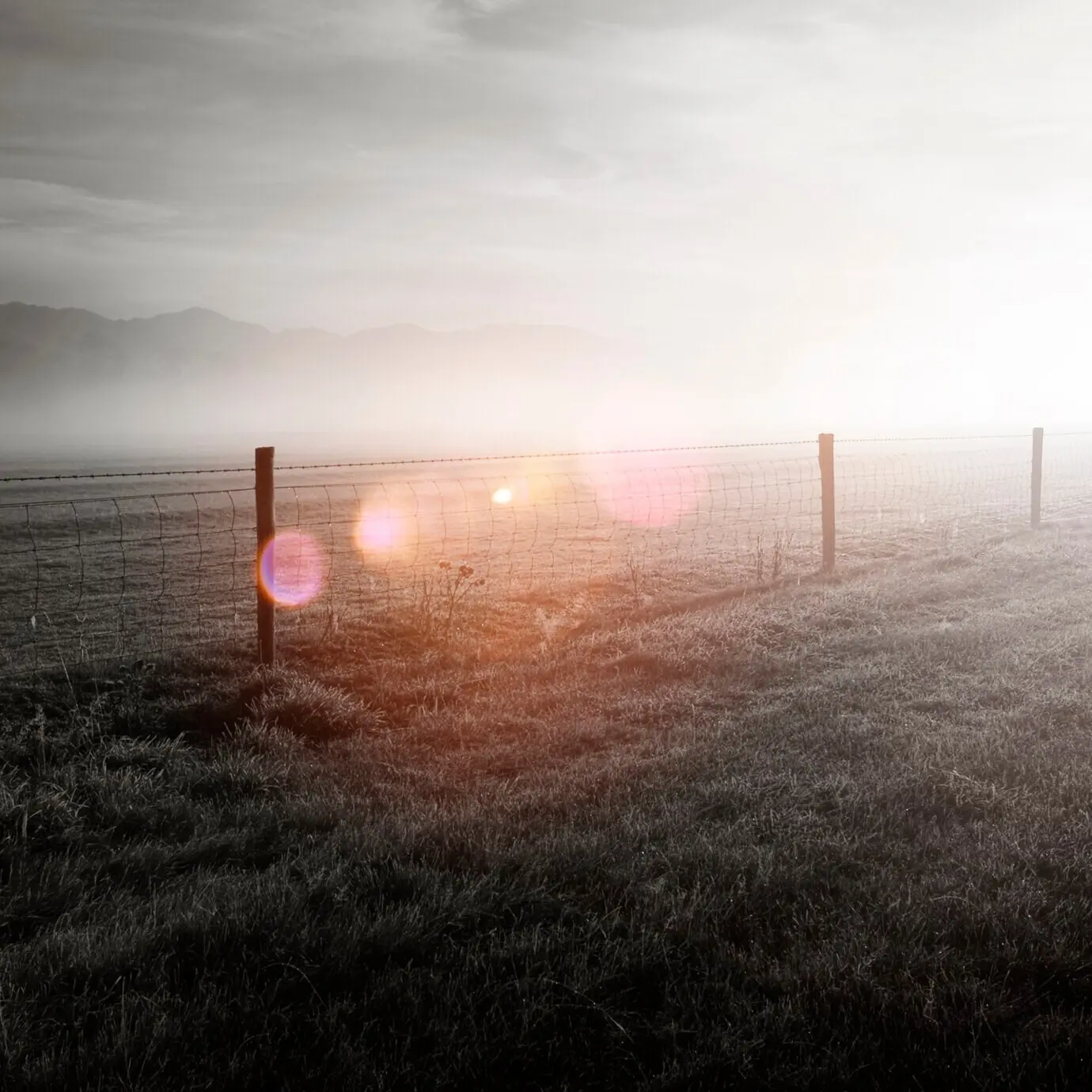
Adopt robust color management so vivid interfaces never oversaturate on consumer displays. Shape whites with subtle tint control, preventing hospital sterility from draining humanity. Protect skin via hue vs hue curves while allowing emissive tech to own its frequency. Introduce narrow-band accents—violet ion trails, cyan diagnostics, magenta anomalies—through keys tied to specific props, preserving internal logic. Gently sharpen edges to sell engineered precision, then relax texture when chaos or biology intrudes. Export test reels to multiple devices to validate translation across ecosystems.

Colorblind-Friendly Choices That Preserve Intent

Design with redundant cues: pair hue with luminance and texture so critical information reads in multiple channels. Avoid relying solely on red-green contrasts; consider blue-yellow separations or shape-based signals. Test subtitles, interfaces, and wardrobe against the scene’s dominant hue to guarantee legibility. If a scare depends on a tiny color cue, add a concurrent sound or motion beat. When possible, invite viewers with color vision differences to review work early. Their feedback often sharpens storytelling for everyone.

Cultural Nuance and the Meaning of Hues

Color is never neutral. Research how festivals, mourning rituals, and political histories assign meanings to hues across regions. A sterile white corridor might suggest purity in one market and emptiness in another. When depicting imagined futures, borrow respectfully from living traditions rather than flattening them into cliché. Build a palette glossary for your project that documents sources, connotations, and intentional subversions. Collaboration with cultural consultants strengthens worldbuilding and avoids unintentional harm while still giving you the freedom to innovate with context-aware confidence.

Iterative Testing, Feedback Loops, and Community

Open your process: share swatches, look stills, and short test grades with peers and your audience, then translate feedback into measurable adjustments. Track how different viewing environments alter intention, from OLED phones to bright offices. Host Q&A streams, invite comments, and credit community suggestions that improved clarity or emotion. Consider releasing a small LUT pack with notes, encouraging others to refine and report. A living color practice grows through dialogue, not guesses, and transforms isolated craft into collective knowledge.
Nazovopokafoviko
Privacy Overview

This website uses cookies so that we can provide you with the best user experience possible. Cookie information is stored in your browser and performs functions such as recognising you when you return to our website and helping our team to understand which sections of the website you find most interesting and useful.