See Stories Through Color
Let’s explore color palettes in movies and TV, discovering how directors, cinematographers, and designers choreograph hues to steer emotion, signal time, and deepen meaning. From candy pastels to bruised neons, color guides attention, foreshadows turns, and traces character evolution. We’ll spotlight iconic choices, unpack practical techniques across production and grading, and share eye‑training exercises you can try today. Share your favorite palette moments in the comments, and subscribe to get fresh breakdowns, prompts, and community challenges every week.
Why Color Directs Emotion On Screen
Long before dialogue lands, color primes the nervous system, nudging perception through associations built from biology, culture, and lived experience. Filmmakers exploit warm‑cool contrast, saturation shifts, and value hierarchy to route attention, calibrate suspense, or soften intimacy. Palettes work like musical keys, modulating emotional registers without announcing themselves. By tracking temperature, harmony, and contrast over scenes, you can feel arcs tighten or relax, revealing subtext, reframing stakes, and shaping memory long after credits roll.
Warm reds, ambers, and honeyed skin tones usually signal safety, appetite, or proximity, while steel blues and desaturated cyans cool the room, slow pulse, and sharpen edges. Savvy storytellers toggle between temperatures to mirror reversals: a cozy kitchen chills after betrayal; a sterile office blushes during an unexpected confession. Watch how micro‑shifts between fill and key create mood swings, and notice how wardrobe either harmonizes or needles the balance to amplify friction or relief.
Meanings are never universal. Red celebrates luck in China yet warns of danger in many Western contexts; white reads as purity in Europe but can signify mourning across parts of East Asia. Global distribution pressures creators to craft palettes legible across borders while still feeling specific to place. Careful art direction folds local pigments—tiles, plants, signage—into frames, allowing authenticity to carry interpretation. As audiences travel, the same color can invite welcome, provoke discomfort, or unmask irony.
Wardrobe as a Color Anchor
Costume often anchors character identity, providing a reliable chromatic signature amidst shifting locations. Designers build capsule palettes for leads, testing fabrics under actual fixtures to avoid surprise metamerism. Reserving a distinctive hue for pivotal beats keeps it potent; overuse dulls impact. Texture matters, too: matte wool swallows light, silk throws highlights, synthetics buzz under fluorescents. Small choices—stitch color, shoe tone, lining—become powerful when frames layer them deliberately against walls, props, and supporting cast wardrobes.

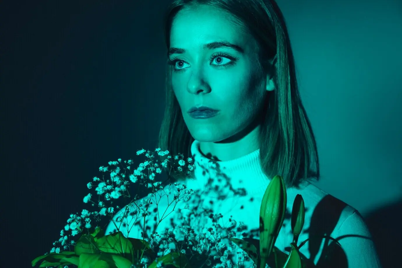
Lighting That Paints
Light is the painter’s brush. Gels shape spectrum, LEDs offer targeted wavelengths, and practicals seed believable sources that carry color through space. Skintone fidelity remains sacred; a palette collapses if faces feel alien. Motivated setups blend warm practicals with cooler windows, moving scenes along emotional gradients without calling attention to technique. Negative fill sculpts contrast, haze blooms highlights, and diffusion lifts halation, all affecting perceived saturation. Light quality, not just color, decides how hues sing or sulk.
Pink Walls, Bitter Truths
The hotel’s rosy lobby welcomes with warmth, but its blush turns ironic as secrets accumulate. Pink buffers violence without trivializing it, recoding danger as decorous tension. When the palette briefly drains, bruised mauves and weathered browns puncture nostalgia, exposing class rot and opportunism. The contrast between piped frosting colors and human frailty creates poignancy, like laughter echoing in an empty ballroom. Color carries the joke and the ache simultaneously, letting the film mourn while it smiles.
Complementary Contrasts That Charm
Turquoise uniforms flirting with coral pastries, mustard signage kissing violet shadows—complementary pairings generate playful energy while keeping compositions orderly. Each frame feels arranged like a candy box, yet every sweet clash nudges narrative beats forward. The eye moves along harmonies to discover plot breadcrumbs: a misplaced red plume, a blue envelope, a green bottle that doesn’t belong. Balance, not maximalism, sustains delight, ensuring accents retain meaning rather than dissolving into decorative wallpaper.
Case Study: Crime, Chemistry, and Sickly Greens
Breaking Bad sharpens moral ambiguity through a dirt‑toned base punctured by acid greens, nicotine yellows, and ritual purples. Albuquerque’s sun scours saturation while interiors stew under fluorescents. Wardrobe becomes a scoreboard for shifting allegiance; the world’s dust grinds into every decision. As Walter evolves, so does the palette, sneaking corruption into domestic space. Color does not just decorate the crime; it metabolizes power, shame, and desperation, tracing a family’s unraveling in stain‑like increments.


Television’s Evolving Palettes in the Streaming Era
Streaming has changed how palettes must perform. HDR expands highlight headroom and color volume, but careless use fatigues eyes on long binges and cheap screens. Directors now weigh thumbnail clarity, autoplay previews, and wildly varied calibration across living rooms. Successful shows build adaptable looks: readable at SDR on a tablet, luminous in HDR on calibrated OLEDs. Palette design considers episode arcs and late‑night viewers, favoring durable contrasts, ergonomic saturation, and skin‑friendly primaries that survive compression.
Daily Palette Diary

Choose one scene every day and list five dominant hues, two textures, and one accent color that steals attention. Sketch rough blocks rather than perfect art; speed matters. Note how light quality modifies the same wardrobe across shots. After a week, compare entries and identify recurring strategies. This discipline converts vague impressions into usable vocabulary, strengthening memory. Post your diary snapshots to invite feedback, and ask others to guess the project solely from your color blocks.
Frame Grabs and Legal Respect
Study is not theft. Use low‑resolution frame grabs for analysis, credit creators, and avoid commercial reuse. Build mood boards that mix cinema stills with your own photos, paint chips, and fabric swatches to translate inspiration into original palettes. Try recreating a look using different tools, forcing problem‑solving rather than imitation. Track what truly drives the feeling—contrast ratios, surface reflectance, composition—so you can adapt responsibly. Respectful practice builds community trust and deepens craft understanding.
Community Challenges and Feedback Loops
Join monthly prompts where we propose constraints—three colors, one practical light, daytime interior—and you share results. Offer concrete feedback: mention temperature balance, skintone health, and value hierarchy rather than vague praise. Iterating publicly accelerates growth, revealing blind spots quickly. We’ll feature standout solutions and interview participants about process, tools, and compromises. By framing critique as curiosity, everyone benefits. Leave a comment volunteering a constraint you want explored next, and invite a friend to participate.