Colors That Shape Journeys and Stir the Heart

Today we explore the psychology of color in character arcs and audience emotion, tracing how hue, saturation, and value quietly steer perception, guide empathy, and punctuate turning points. From a protagonist’s wardrobe to lighting cues and grade, evolving palettes can foreshadow choices, signal reversals, and deepen catharsis. Expect practical tools, surprising research, inclusive practices, and real‑world anecdotes that help you wield color with intention while inviting your audience into a richer, more felt experience of story.
From Palette to Persona
Character identity often crystallizes through color before a single line is spoken. A carefully limited palette can suggest discipline or constraint, while playful contrasts hint at curiosity or conflict. Viewers intuit psychological cues from subtle shifts in tone and temperature, reading emotional states long before they are verbalized. When the palette breathes with the character, every scene becomes a mirror, reflecting motive, doubt, and resolve with persuasive clarity that quietly binds audience attention without heavy exposition.

Arc Milestones Painted in Light
Color marks story beats as surely as music does. An initial palette introduces baseline worldview; new hues intrude at disruption; inversions spotlight crisis; reconciled combinations affirm growth. When mapped across acts, these shifts create a rhythm viewers feel beneath plot mechanics. The result is coherence: a sensory spine that binds scenes into journey. Plan changes purposefully so each transition invites the audience to lean in, sense stakes rising, and anticipate the next emotional contour with curiosity and care.
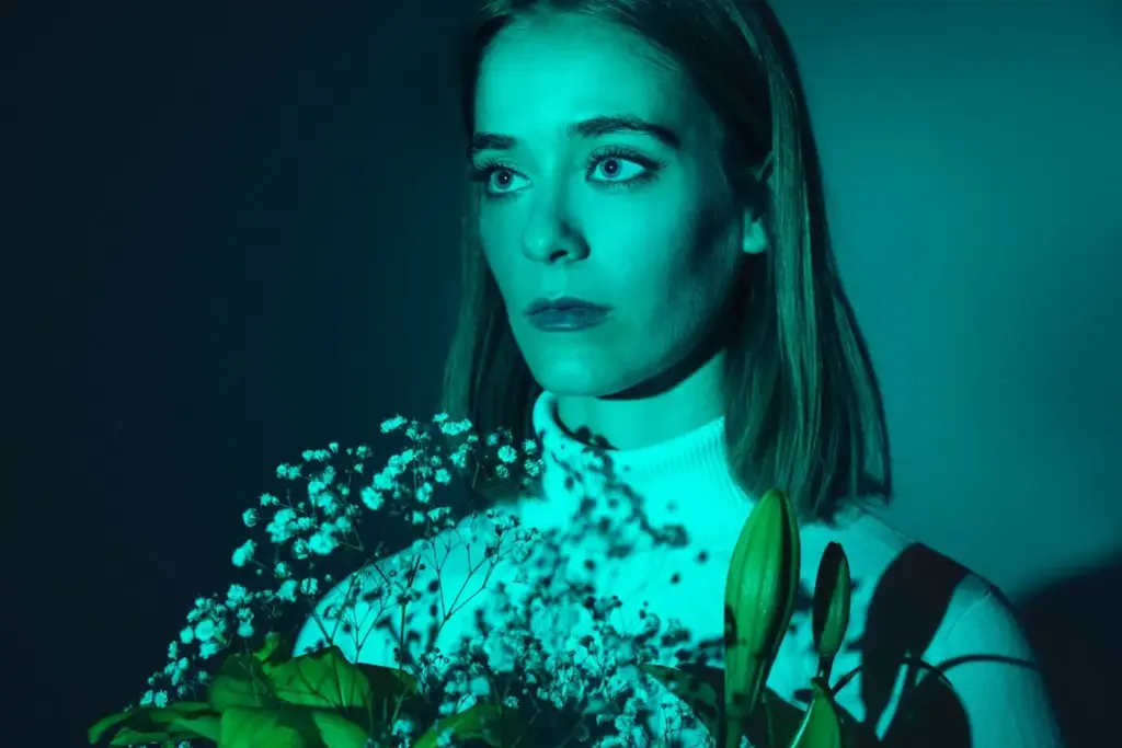
Inciting Hues
The first disruption often arrives with a color that does not belong, an unexpected accent in wardrobe, set dressing, or practical light. That intrusion should tempt the protagonist toward risk while tugging the viewer toward questions. Why now? Why this glow? Use micro‑contrasts—one scarf, a blinking sign, a folder’s tab—to plant a visual seed. The promise: follow this color and you’ll discover possibility, cost, and the new values competing for the character’s loyalty.
Midpoint Inversion
At the midpoint, flip or complicate the palette to register a trap, revelation, or bold commitment. Cool worlds can suddenly pulse with acidic greens; warm sanctuaries may bleach toward sterile blues. This pivot should feel earned, like an emotional key change. Let the environment collaborate: streetlights, monitor glow, stained glass, or weather tint the skin and eyes, making the character appear different because they are thinking differently. The audience senses momentum shifting even before dialogue confirms it.
Climax Crescendo
For the climax, concentrate colors that embody the hard truth the character finally accepts. Fewer notes, stronger presence. If earlier scenes scattered signals, now they unify, either purifying to a single dominant hue or harmonizing previously conflicting tones. Avoid merely turning everything red; design a crescendo that reflects consequence and choice. The payoff is not loudness but clarity, the feeling that visual and moral wavelengths are finally aligned, allowing authentic catharsis to land and linger.
Physiology of Arousal

Laboratory studies link warmer hues to elevated heart rate and cooler hues to calming effects, with saturation amplifying impact. But lived scenes are messy: distance, texture, and surrounding tones reshape response. Use this knowledge as a compass, not a cage. For urgency, combine warmer accents with crisp contrast and sharper motion; for composure, soften edges, cool temperatures, and widen breathing space. Invite the body to feel the beat of the arc instead of forcing it.
Cognition and Meaning

Associations are learned and layered. Blue may signal trust in finance, melancholy in ballads, or divinity in iconography. Stories teach viewers how to read the palette by repetition and payoff. Seed early meanings, then confirm them at turning points so colors accumulate narrative weight. Be wary of clichés: fresh pairings can surprise without confusion if the script anchors them to motive and consequence. Let color become a vocabulary that characters and audiences learn together, scene by scene.
Crossmodal Echoes

Color does not act alone. Sound design, texture, and pacing reinforce or contradict what the eye receives, shaping overall emotion. Muted palettes sing with soft diegetics; neon thrives with rhythmic accents. Use synesthetic thinking: ask which timbre matches that amber hallway, which cadence matches that cobalt sky. Alignment multiplies effect; intentional dissonance creates tension. When visuals and audio collaborate, the audience feels immersed, as if the world itself breathes with the character’s changing inner life.


Culture, History, and Context
Meanings travel with people. Red may celebrate luck, revolution, or warning, depending on place and memory. White can imply innocence in one setting and mourning in another. Historical availability of pigments shaped aesthetics, just as new technologies reshaped cinema’s palette. Respect these currents. Research sources, listen to consultants, and treat lived traditions as narrative assets. When you honor real contexts, your color decisions feel specific rather than generic, producing resonance that welcomes more viewers into the emotional circle.

Practical Craft for Writers, Filmmakers, and Designers
Translate intention into a repeatable workflow. Build a color script that tracks emotional beats, collect references that prove feasibility, and communicate choices across departments early. Wardrobe, production design, cinematography, and grade must hum in concert. Use quick tests to verify that colors read under actual lenses and lights. Keep an annotated lookbook, update after rehearsals, and share with collaborators. Treat color like character: with goals, obstacles, allies, and a journey the audience can feel evolving.
Ethics, Accessibility, and Inclusion
Power invites responsibility. Strong palettes can guide emotion, but they can also exclude or overwhelm. Design for diverse color vision, respect audience autonomy, and avoid manipulative shortcuts that bypass consent. Provide sufficient contrast, alternative cues, and contextual explanations where needed. Seek feedback from communities represented and from viewers with different sensory profiles. When people feel considered, they engage more deeply, trust your craft, and share the work, strengthening the story’s cultural life beyond opening night.